How We Built the Da Vinci Days Mobile Website

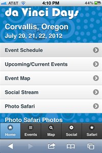
Last year we (ProWorks) created a mobile site for the da Vinci Days festival that is held in Corvallis every July. We had created the initial site the previous year and with the rise of mobile and the fact that most people will only have a small screen at the event, it was a must have. Of course, responsive web design was just becoming a thing and we had a decision to make: responsive or separate site?
The Decision: Responsive vs. Standalone Mobile Site
In our case we clearly chose the separate mobile site and here's why:
- At a large event like da Vinci Days people the key things people want to know are: "what events are coming up?" and "where is the event I want to attend located?"
- We built the main site with Umbraco which supports multiple sites within a single install. This allowed us to pull the same content as the main site so there wasn't an issue with having to maintain content from two separate sites. It's pulled from the same location in the content tree.
Once we decided on a separate mobile site we had more options available to us and could do mobile-specific functions that may not make sense on a desktop browser.
Adding Mobile and App-like Features
We wanted the mobile site to feel more like an app as opposed to a width constrained web site. To accomplish that we chose jQuery Mobile. It is a framework that adds UI and functionality elements to websites to make a normal web site feel more like an app. Some nice things its adds out of the box that we used are:
-
Themes.
The buttons, menus, popups, and toolbars all have a nice look at feel and an app-y feel thanks to jQuery Mobile themes. This required a little cusomization to reflect the da Vinci Days brand, but the really sped up the build process.
-
Page transitions, and caching.
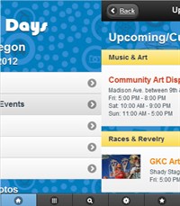
jQuery Mobile loads new pages into the DOM and then it can apply sliding transitions to the pages so the browser experience feels more app-like and less jarring to the user. Because the page is loaded into the DOM, the back button and navigating back to a page already loaded is very fast and uses less data than simply reloading the pages again.
-
Bottom toolbar.
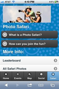
The bottom toolbar menu that is ubiquitous is another application style UI element that jQuery Mobile adds. I like the quick access to the main feature of the site that someone would want on the go.
-
Location and walking/biking directions.
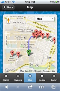
The Google Map page using the HTML5 location API to request the current location of the user. If granted, their location is placed on the map relative to the event locations they may be interested in. In addition, Google gives us the ability to give walking, biking, or driving directions to all the locations. Pretty awesome for an event like da Vinci Days because the events range up to a mile or two away from the main festival area.
What do you think of our decisions? Anything you would have done differently? Do you use your mobile at festivals and concerts to get information and interact?

